Website footers have evolved from a simple place where you host your copyright information to a section where you can host an extended set of navigation items, links, sources of contact information and more.
Basically, it’s a place where you can create an extended navigation menu for all of the links and things that you couldn’t put in your site’s header.
Great web design takes careful consideration of navigation and usability from the site’s header all the way to a complementary footer.
Things You Can Place in the Footer of Your Website:
- Quick “About” Information: Who are you? What do you do? What’s this site about? This is a great place to add a head-shot and a few sentences to tell readers a little bit more about your with a link that reads “Read more.” They’ll click it if they want to learn more.
- Quick “Contact” Information: There are two places your contact information needs to be prominently placed: 1.) On the upper right-hand side of your site, and 2.) on the footer of your site. Granted, not everyone necessarily scrolls down to the bottom of a site. But if they’ve just finished reading a long article, and they want to get a hold of you, well, there’s your contact information right at the bottom of the page they just scrolled down.
- Testimonials: I don’t think enough people make proper use of testimonials on their website. They’re a great form of social proof. It’s the ultimate way to brag. It’s like saying, “Look, I’m very good at what I do. But don’t take my word for it, here’s what other people have to say about it.” The footer of your site, right next to your contact information is a great place to showcase some of your best testimonials.
- Email Sign-up Form: There are various places you can promote your email list sign-up form and the footer of your website is certainly one of them.
- Disclosures: No need to clutter your sidebar with these items, but they’re still important. You can place them neatly in the footer of your website along with your copyright and other contact information.
- Expanded Navigation Links: You might service a vast variety of areas but it’s difficult to put tons of links on the header of your website for risk of creating an overly cluttered navigation menu. The next good place to add some of these extended links is in neatly organized sections of your footer.
- Contact Form: Granted, few people will make use of this but a simple contact form is going to make it easy/easier for some people to contact you. Rather than have to click away to your contact page, they can read an article, or view a listing page, then scroll to the end of the site and see that they can submit an easy contact request.
These are just a few ways you can make better use of your footer information to give site visitors a better over-all search experience on your website. And like I said, a well designed footer complements a well designed header and navigation menu.
The following is a collection of real estate websites that have decided to improve their site’s navigation and user experience by making use of their site footers a little more creatively. Have a look, then tell me which one’s your favorite?
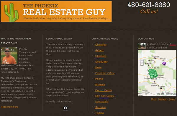
Notice how the footer design complements the header design by re-inserting the site’s logo. Then, everything is neatly spaced out giving you just a little bit of everything: About the author, links to search listings in various communities, contact information, and the necessary legal disclaimers.
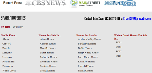
What I love about this example is the added social proof just above the footer content. So on the one hand, he’s giving you easy access to local real estate by area of your choice, but right above it are logos from mentions of recent press coverage.

This one’s simple. It says “we have a little bit of everything.” Information for buyers, sellers and really, anyone wanting to learn more about the local community. We’re registered with the Better Business Bureau and here are our additional affiliations.

This one’s great and simple too. Here’s my contact information if you need to get a hold of me, and over on the right, you’ll find a list of all available real estate in different areas but also, by area type.
5. InTownElite.com.
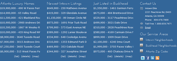
This one utilizes the Diverse Solutions WordPress IDX plugin to display recently listed properties in each of the prominent areas they specialize in. And if you need to get a hold of them, no problem, there’s their contact information.
(Disclosure: I work for Diverse Solutions so of course I’m going to tell you the plugin is awesome. But don’t take my word for it, you can test-drive it free here).
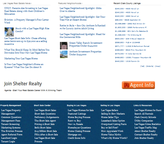
This website has a great internal link structure through and through and their footer area is no exception. They’ve added an excellent extended navigation menu to complement the rest of the navigation on the site here while giving enough padding between sections so it’s not too difficult to read/access.

Love the big prominent display of contact information. They’re not afraid to put a face to their name, and they’re making it incredibly simple to get a hold of them. Well done.
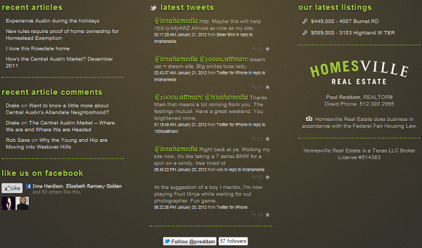
This one is one of my favorites in terms of design. Though I’m not a fan of providing social networking links on your site, this one do so rather elegantly. The “Like” and “Follow” buttons aren’t intrusive, but rather neatly and strategically placed. Oh, and here are our latest listings and articles on the blog.
Simple and well designed.
9. SarasotasFinestProperties.com.
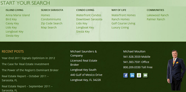
I like two things about this one… First, I like the “Start Your Search” title to the footer section. The latest real estate listings by area and area type are provided but I think the title here in this case serves as a neat and subtle Call To Action. Then, I like that he puts a face to a name with a professional photo in the footer right next to his contact information. Some people might think it’s cheesy, but let’s face it, sometimes, buyers/sellers like to be able to see who this person actually is.

Again, a little bit of everything. Here’s the latest real estate news (from the blog). Here’s a little bit about me. And if you need to get a hold of us, here’s our contact information.
11. SanDiegoCastles.com.
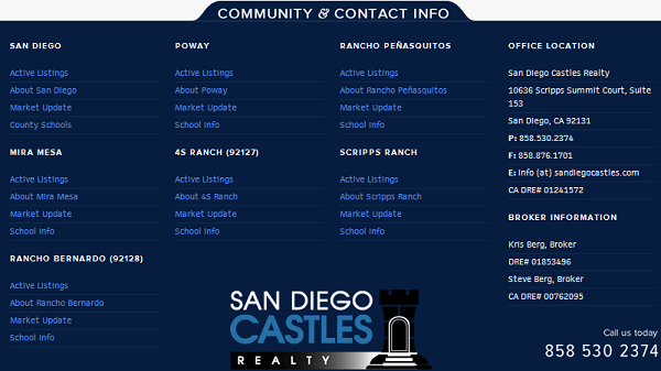
Here’s why this one’s impressive… Not only do they provide a neatly structured navigation menu to search for real estate in each of their different coverage areas, but they provide added navigation to look at market updates, school information and additional information about the local community. It goes well above and beyond “click here to see Mira Mesa real estate.”
12. MaxSell.net.

I think most websites don’t make much use of client testimonials as a marketing strategy. This one does and that’s what I love about it. It’s simple. You can search for homes here… Here’s our contact information. Oh, and by the way, here’s what recent clients have to say about the great work that we do.
13. MyDupontCirlce.com.

Again, simple. A simple, neatly presented navigation menu. Here’s who I am, you can connect with me on these social networks, and here’s the latest from the blog. I’m not a fan of loading your sidebar or header navigation with links to your outside social networks. In this case, I think their neatly placed.
14. msqrealty.com.
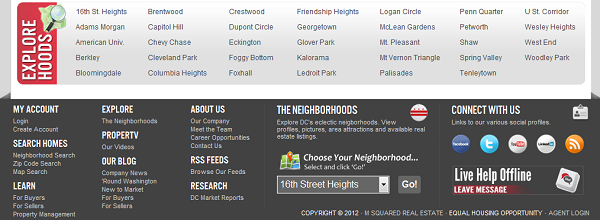
Now this one’s impressive. A lot of information neatly structured in a compact space. You wouldn’t be able to place all of these items in the site’s primary navigation. It’s really quite overwhelming. So in this case, the footer adds to the sites overall navigation by properly complementing the header.
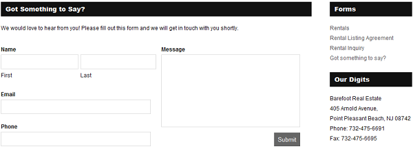
Here’s an example of a real estate website using a contact form on their site’s footer section. It may be that not too many people will use it, but if you need to easily and quickly get a hold of us, here’s the contact form. Fill out your info, your question(s) or comment(s) and hit submit.
But they also don’t hide behind a contact form, there’s their contact information right next to it as well.
16. Improvemental.com.
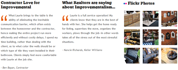
Again, another great example of someone using the power of testimonials to promote their work. In this case, Laurie March is an interior designer who works directly with clients and contractors as well as with real estate agents. So she displays some of her best client testimonials to add credibility to her work. But she doesn’t stop there, she also adds a ton of photos from recent projects for you to dig through as well.
17. ThePetersonGroup.com.
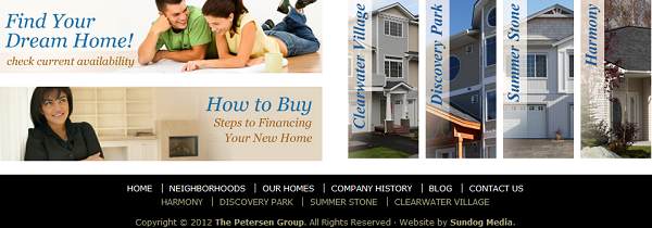
This is probably my favorite display of visuals to create a navigation structure. Each Call To Action is neatly presented through a powerful visual. Want to learn more about the steps you need to take to get financed on a new home? No problem, click here.

Here’s what I like about this one… They let you know that this website is mobile friendly. Want to take your home search on the go? No problem, we’re optimized for mobile.
With more and more consumers using mobile, this is important. Really, really important. But don’t just make your website mobile, let consumers know that it’s mobile. Remind them at every opportunity that they can access your search site while they’re out and about.
19. BestCalgaryHomes.com.

This one’s very simple but it complements the header very well – it’s proportional in design. It’d be weird otherwise to have a small header design and an overly large footer area and vice versa.
In this case, this one communicates a simple message. Here’s who I am, here are my designations and here’s my promise to you.
20. thebrandid.com.

This one’s not a real estate website but I love the power of visuals here and think it can easily be applied. When you hover over each of the photos here, it displays a client testimonial. So as in the few examples above, it’s using the power of testimonials as a marketing strategy. Again, great social proof. BUT, unlike the others, this one adds a face to the name. Which makes their presentation a little more powerful.
Testimonials are a great way to establish your credibility and I think this site does that very well in this example.
Which One’s Your Favorite?
Which one of these footer designs is your favorite? What do you like about it? Did you pick up any ideas for how you might design/re-design the footer section of your own website?
I’d love to hear your thoughts in the comments…

Nice list! My footer emulates InTownElite.com – I love the functionality of that site.
I didn’t have enough space to capture it, but what I love about the Intown Elite site is the iPhone image they have and the landing page they created to let users know that they can take their home search mobile. It’s really a nice touch!
Thanks for including mine with all these great examples… I think a lot of people forget, or even discount the footer. But I know for a fact visitors look there.
Totally agree with you, they are heavily discounted so it was neat to go through and pull out these examples.
Of course now my question to you is, how do you know people are looking there? Simple analytics? Heat map?
Great list, Ricardo. It sure gives us some ideas of what to implement in the next redesign.
Amazing write-up! This could aid plenty of people find out more about this particular issue. Are you keen to integrate video clips coupled with these? It would absolutely help out. Your conclusion was spot on and thanks to you; I probably won’t have to describe everything to my pals. I can simply direct them here!
All great real estate footers, but Silverado Properties caught my eyes: usability & design.
Real estate, as an industry, encompasses a vast array of properties and transactions, ranging from residential homes to commercial buildings, vacant land to industrial spaces. At its core, real estate deals with the buying, selling, and leasing of tangible assets, often representing significant investments for individuals, businesses, and investors alike.skilled tradies