If you’re getting a fair amount of website traffic, but aren’t converting those site visitors into subscribers (or buyers), you’re doing something wrong.
That could be due to one of several reasons:
- Poorly placed Call To Action.
- You’re failing to communicate what your site is about.
- You’re failing to persuade people through the use of social proof.
In this post, I’m going to show you some examples of effective blog home page designs that convert.
But first things first…
How To Make a Static Home Page for Your Blog
WordPress makes it easy to set a static home page for your blog. To do this, simply perform the following steps:
- Create a new page within WordPress that you’ll want to set up as your new home page.
- Then, hover down to “Settings” within your WordPress dashboard and click on “Reading.”
There, you’ll want to select the option to set your front page as a “static page” and select the new page that you created from the drop-down menu. It should look like this:

The benefits of setting up a static page as your home page within WordPress are that you can effectively communicate what your site is about to first time site visitors (you can promote your products, services and display a Call To Action to subscribe). And, if you’re not updating your blog on a regular basis, well, no need to worry. You can quietly hide it away as a tab on your site’s navigation menu so new site visitors don’t see that you’re last post was 3 weeks ago.
You don’t need to have a static home-page design, there’s no “right” or “wrong” here. Instead, I simply wanted to hi-light some of the benefits of having a static home-page design by showcasing some sites that have a great home-page design that clearly demonstrates their value proposition, showcases their product/service offering, and converts (I’m talking email sign-ups here).
So, without further ado, here’s…
10 Strategic Blog Home Page Designs That Convert:
1. Copyblogger.com.
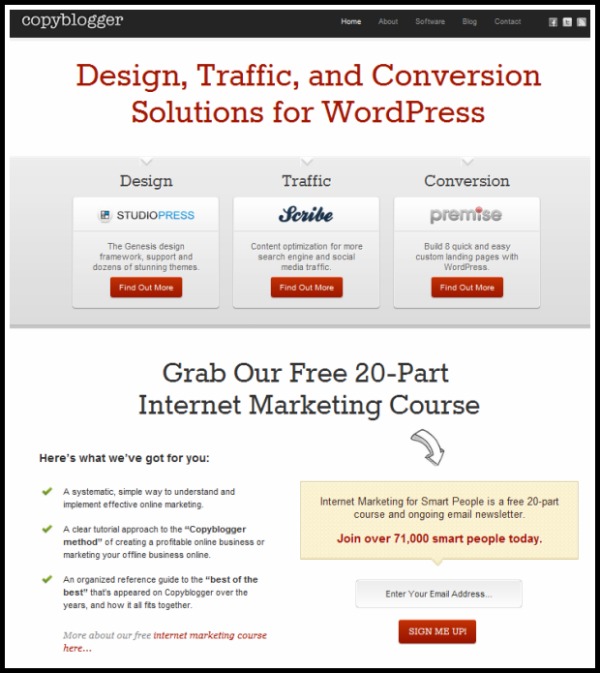
There’s a lot that I like about the Copyblogger home page. In particular, I like the direct emphasis on the Copyblogger Media line of products:
- StudioPress – which offers a variety of premium WordPress theme designs.
- Scribe SEO – a WordPress plugin designed to help you optimize your blog posts.
- Premise for WordPress – a killer plugin designed to help you build a membership site quickly and develop killer landing pages. (Yeah, it’s pretty awesome).
Often times, you’ll see a blogger link to his/her line of products on the sidebar of their site or on a page in their navigation. Here’s, the products are front and center so it’s the first thing site visitors see.
Furthermore, I really like the emphasis on the newsletter opt-in. Again, often times, bloggers will link to their newsletter on the sidebar of their site or in their site’s navigation. Here’s, it’s prominently displayed above the fold to encourage site visitors to subscribe. It clearly states the benefits, demonstrates excellent social proof by showing you how many others have already subscribed, and it’s a simple one line sign-up form.
2. Chrisg.com.
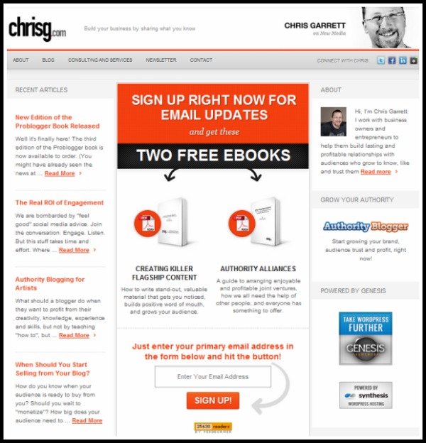
This one’s easily another one of my favorites.
Chris Garrett does an excellent job of emphasizing his email sign-up and makes the benefit really stand out — get two free ebooks the moment you sign up. Personally, I think free ebook downloads are a great way to drive email sign-ups!
At first glance, this one’s a bit busy for my taste. But Ramit really knows his stuff and he executes some amazing product launches. His home-page is nicely designed for lead capture and he’s using all of the write elements of social proof to really show that he know’s his stuff.
4. DannyBrown.me.
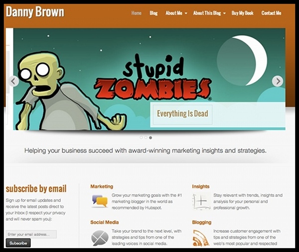
Danny recently redesigned his blog and switch from having the blog as his home-page, to having a more traditional website design with a static home-page. He offers an excellent explanation as to his motivation(s) for doing this and frankly, I agree.
Personally, I think having a static home-page like this allows you to put emphasis on the business, rather than just the blog. And if you’re blogging for business, rather than to fulfill a hobby, that makes perfect sense to me.
Now, some people will argue that he’s not emphasizing this email sign-up form very well (it’s on the left sidebar just below the slider), but if it’s converting, then more power to him 🙂
5. YoungPrePro.com.
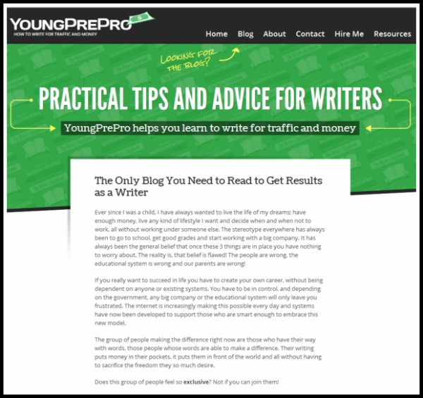
I like Onibalusi’s guest posting strategy. When he write’s a guest post, he often redirects people to a page that emphasizes the benefits of subscribing and asks for the email. Most people just link to their blog, or to their home-page, which really has no sense of direction (there’s too much going on).
Here, on Onibalusi’s home-page, there’s one, very clear Call To Action: he wants you to sign up to his mailing list!
Very well executed.
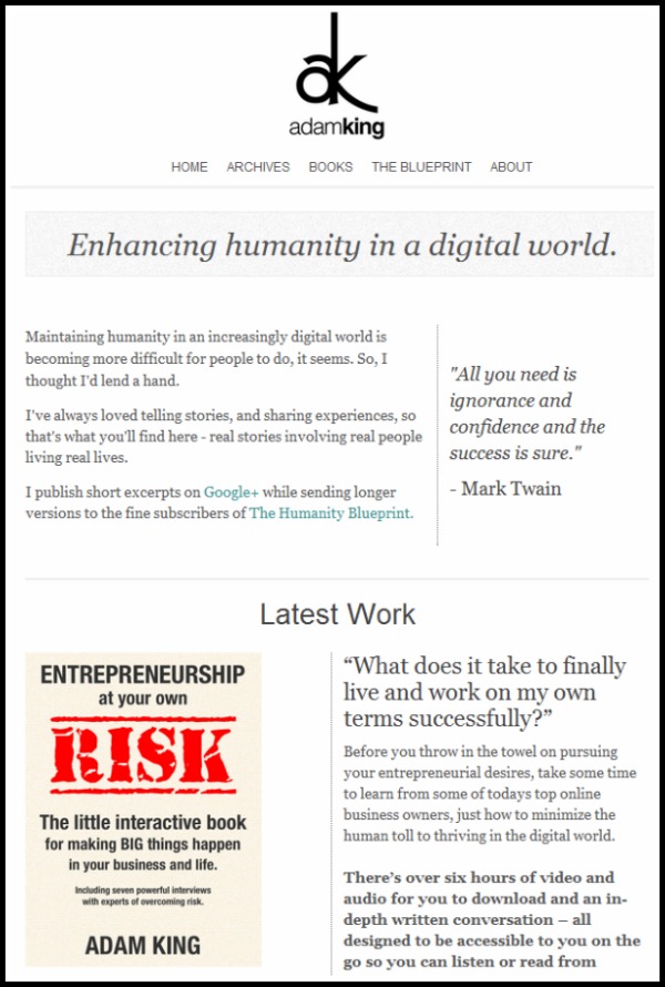
6. AdamKing.me.
Adam’s story is unique. I love what he’s doing as a writer and I love his site because of it’s simplicity. He makes great use of white-space and really makes it easy for people to access his work.
(Note: Looks like he recently changed his home-page design. Frankly, it still looks great).
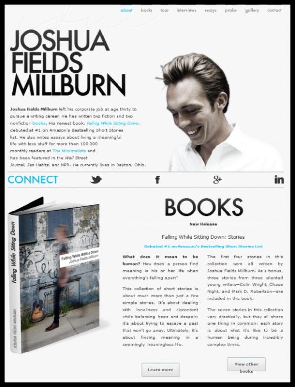
Joshua Fields Millburn is a writer extraordinaire. I couldn’t think of a better design/lay-out to introduce his work to the world.
It’s a very clean, simple landing page that introduces him as a writer and puts emphasis on his work.
Ok, you have to visit Mike’s website. Click on the links to access the site. (Go ahead, I’ll wait).
Seriously, it’s hilarious!
I love the fact that Mike went ahead an injected a little bit of humor into his design.
And ok, so the home-page doesn’t tell us much. There’s no “About” info, or an email sign-up form, but he reels you in with his sense of humor. (And if you don’t have a sense of humor, well, I don’t know what to tell you). But you gotta love that about a brand.
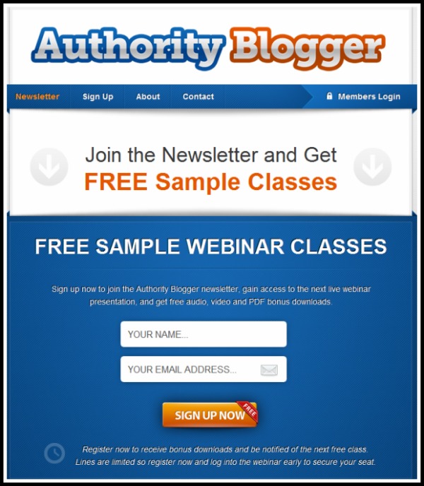
This one’s a bit different from some of the other site’s mentioned here because it’s for a membership site by Chris Garrett.
I love it for it’s simplicity (and I’m sure it’s effective). See, when I started my own subscription site (Real Estate Blog Topics), I knew that I needed to start building a mailing list…fast! I did that through the newsletter here on my blog, and via a capture form on the site. But it’s not very prominent. At least, not nearly as prominently displayed as Chris has his here. Something to think about…
If you run a membership site, how are you capturing email? How can you change things up for better conversion?
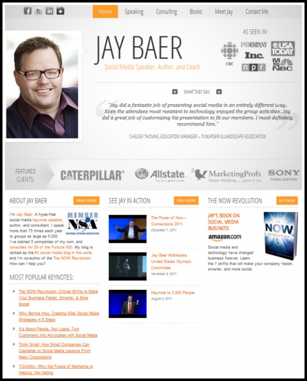
10. JayBaer.com.
I’ve seen a lot of speaker websites. It was part of my research as I was building my own. But honestly, I’ve never seen a better designed speaker page…
Jay Baer and his killer design team really knocked it outta the part with this one! Have you?
Lessons To Apply To Your Own Blog:
What lessons can we take away from these blog home page designs?
- Communicate your value. Your home-page should clearly state your value proposition to the reader. What’s your site about? How will this site, help you?
- Add social proof. This is how you show people that you’re a credible resource. If you’re a speaker, you hi-light previous speaking engagements, press mentions, et cetera. Ramit Sethi (example #3) does a phenomenal job of showcasing his expertise by hi-lighting his various press mentions. “Social Proof” is what convinces people that you know what you’re talking about.
- Ask for their email. Most of the sites on this list are optimized to convert readers into subscribers with a prominently placed email capture form. If you’re not using email, you’re missing out.
If you’re not consistently updating your blog, having a static home-page is a good idea. It helps put emphasis on your service/products, and it’s a great place to setup a landing page for conversion.
Hopefully, this short list of sites gives you some ideas to implement.



They all look great but they has their own unique concept for their websites.
thanks for the great tips provided here.
They each do, but it’s neat to see how they each implement and emphasize their work. Picked up some good ideas from these myself 🙂