 A Call To Action is simply messaging that drives a site visitor to do something – fill out a form, opt-in to a mailing list, et cetera.
Without a strong Call To Action, site visitors may not feel an urgency to click and take action and just like that, you’ve lost a potential lead.
So, how do you encourage site visitors to act? How do you get them to take action?
Sometimes, reading about “best practices” isn’t the same as seeing them, so I thought I’d share a couple of well done examples of effective Calls To Action…
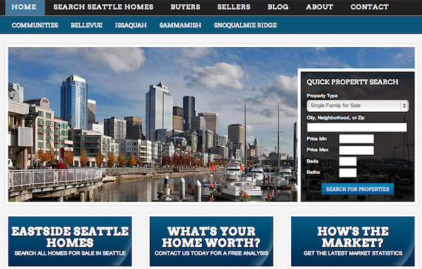
Example #1: AnthonyGilbert.com
Design a Home Page That Converts
Design for the consumer experience and the actions you want them to take. Don’t add a bunch of things that you you think are important. Instead, only add things that drive site visitors to access the information they were looking for.
In real estate, people are generally coming to your site to:
- Search for homes.
- Find out how the market is doing.
- Find out what their home is worth. And,
- Learn more about the local community.
So design around that. Nothing else matters.

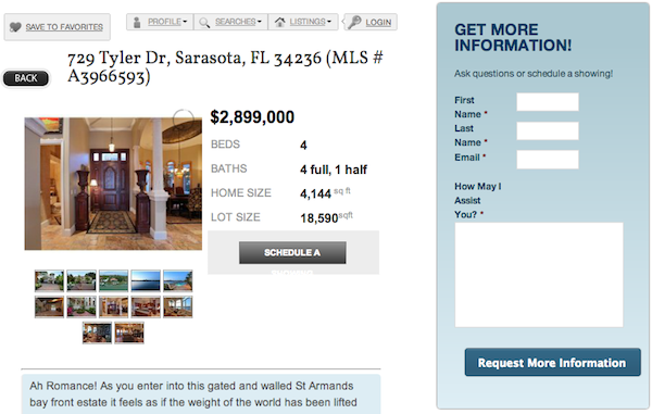
Example #2: WeSellSarasota.com
Make It Easy for the Consumer To Contact You About a Listing
Sometimes, small changes can have a big impact. Take your listing details pages for example… No matter what IDX provider you’re using, they almost always have an “Ask a Question” button. But what if you added a big, prominent contact form to the sidebar of that page to make that form submission action even easier?
The easier you make it for the consumer to be able to take action on something (like contact you), the more likely they are to do it.
Here’s a great example from real estate agent Bill McCue.

Example #3: FindMyWayHome.com
Use Your Sidebar Space Wisely
Too many real estate websites get caught up chasing the wrong numbers:
- Follow us on Twitter,
- “Like” us on Facebook,
- Give us a “+1.”
That’s all fine and dandy, but it’s distracting the user from the action you want them to take. Your goal should be to get them to contact you about buying or selling a home. Or, if you’re a loan officer, it’s to get them to contact you about financing options on their next home purchase (or a refinance).
Here’s a great example of a mortgage website that puts emphasis on the right kind of calls to action for their audience…
- Still have a question? Call us, here’s our number…
- Wonder if you even qualify? Here’s what you need to know…
- Are you a first-time homebuyer? Check out our first-time homebuyer programs…
All very specific calls to action intended for one thing… To get the consumer to initiate contact. Not chasing “Fans” and “Follower” numbers.

Example #4: MSQRealty.com
Build & Optimize Your Landing Pages
A landing page is simply a dedicated page on your site where you drive traffic and guide the user towards taking action on something like:
- Downloaded a report,
- Submitting their email address,
- Filling out a form (to receive a CMA for example),
et cetera.
You can create neighborhood landing pages full with IDX data and have people opt-in to receive daily email updates on new listings that hit the market-place for that area. Or, you can create a landing page with an opt-in form to receive a Comparative Market Analysis as in the example below.
You can then send traffic to that page through a variety of methods:
- Traffic sent through a CTA on your blog sidebar or footer of your posts.
- Traffic sent through a CTA on your email list.
- Traffic sent through a PPC campaign that drives click-through traffic to that page.
Once they opt-in, you’ve now generated a high-quality lead and you have yourself a growing email list to send your marketing messages to.

Example #5: MyNapervilleHomesBlog.com
Grow Your Email Opt-in List
Email provides you with a direct line of communication between you and your customer. Done right, it moves your customer from conversion (the initial opt-in) to sales (taking action – in real estate, that’s contacting you about a listing).
There’s a couple of ways to grow your email list:
- By using a pop-up form similar to the one Mortgage Broker Scott Schang uses here.
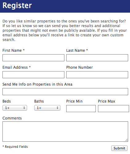
- Add an opt-in form to your IDX landing pages where consumers can sign up to get daily listing alerts by email.
Here’s an example of a listing details page that implements a nice opt-in form on their IDX search pages.

Every Website Should Have a Call To Action
Think about what action you want your site visitors to take, then work on improving your existing Calls To Action to make them more prominent and eliminate the things that don’t drive users towards your goal. Or put another way, get rid of the clutter.
Any ideas from the examples above that you might implement?

Great article. Very helpful.
Thanks Clay, glad you liked it 🙂