 In 2006, Seth Godin wrote an article that highlighted the 5 purposes of a landing page, and they’re still true today:
- Get a visitor to click (to go to another page, on your site or someone else’s).
- Get a visitor to buy.
- Get a visitor to give permission for you to follow up (by email, phone, etc.). This includes registration of course.
- Get a visitor to tell a friend.
- Get a visitor to learn something, which could even include posting a comment or giving you some sort of feedback.
Today I’d like to focus on #3. Creating a landing page with the purpose of getting users to submit a contact form and/or register to receive updates on recently sold listings.
If you have a real estate blog, the goal of your blog of course is to engage in conversations about buying or selling real estate with your readers.
In our case, we’re looking to create a landing page for the purpose of attracting and engaging potential sellers in conversation about the value of their home while positioning yourself as the go to listing agent when they’re ready to sell.
We’re going to do this by creating a landing page where the dialogue is:
- If you’d like to know the value of your home, simply enter your information here (this is your Call To Action).
- Here’s what has recently sold in your area and here’s the average days on market for listings like yours. (The suggestive dialogue here is, “this is the profit you can expect to make if we sold your home today).
So, let’s get to it.
Here are 3 simple steps to designing the ultimate landing page for generating new listing leads…
Step #1: Create your new landing page in WordPress.
You want to design a page that’s grabs your reader’s attention, emphasizes your Call To Action, and nothing more. To do this, I’d use a single-column layout with narrow margins to increase reading comprehension.
If you’re using the Genesis Framework and any one of our StudioPress themes, most of them come with a landing page template built right into the theme. Alternatively, you can simply create a new page and select the “Full Width” template under your “Layout Settings” within your page editor.
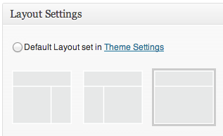
I’d go with a single-column layout because it eliminates clutter and puts the focus and attention on your content and your desired Call To Action. All too often, it’s easy to get carried away and add additional elements to that page that just aren’t necessary at all.
Step 2: Let’s write some copy that converts.
You don’t need a clever design to get your new landing page to convert. What you need is good copy. You need to write something so clear and succinct that encourages your readers to take action. You do this by hitting on a couple of key points:
- Write a compelling headline that engage’s your readers interest. Your headline should be both relevant and communicate what the reader can expect to derive from the page.
- Provide a clear call to action. Your call to action can be a link that takes a reader to another page on your site, a button, or a simple opt-in form. Whatever it is, it should be prominent and obvious so that when the reader lands on your landing page, it makes them think: “Oh, that’s what they want me to do.”
- Write simple, clear, persuasive copy. Your copy should be short enough to communicate the benefit of what you have to offer and insite your reader to take your desired action. Short and simple and not a sentence longer than it has to be otherwise you’re going to lose your readers attention long before they can get to your form, fill it out and hit submit.
- Make it easy to submit your registration or opt-in form. The fewer the fields the better. And make sure your form (your Call To Action) stands out from the rest of the items on your page. Your readers eyes should be drawn to the form as if to say: “Oh, THAT’S what they want me to do here.”
Hit on each of those key elements and you’ve got yourself a landing page that’s ready to convert.
Step 3: Create and embed your lead generation form.
So, you’ve created your landing page and you’ve drafting your copy. What you need now is your conversion form. In this example, I’m going to use Gravity Forms.
To create a new form:
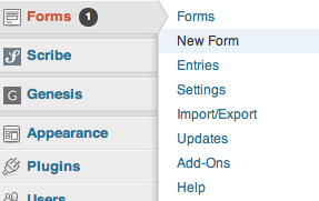
- Log into your WordPress dashboard.
- Hover over “Forms” > click on “New Form.”
Once there, you can start building your new form. Simply edit the form title and add your desired fields using the advanced field options on the right.
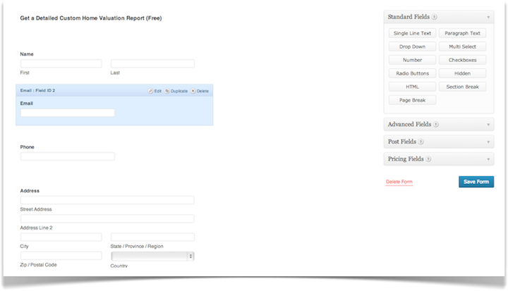
In this example, I titled the form: Get a Detailed Custom Home Valuation Report (Free). Then, I added the following fields:
- First/last name.
- Email.
- Number.
- Address.
- Comments (this is simply a “paragraph text” field from the “Standard Fields” section).
Click on “Save Form” on the lower right-hand side of the page and you’re all set to embed your new form on your custom landing page.
When you’re in the page editor for your new landing page, you’ll see a button for “Add Form” right next to the “Add Media” button. Click on that and it’ll prompt a pop-up window to embed your new web form:
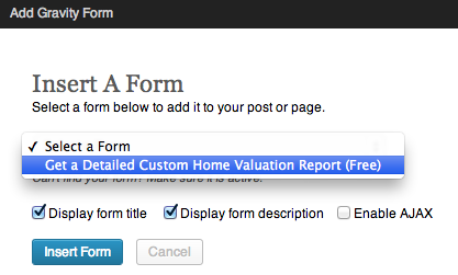
Select your desired web form and click on “Insert Form” and you’re all set to go! (What you get is a landing page that looks something like this).
Now let’s take a look at some live examples of effective landing pages in action…
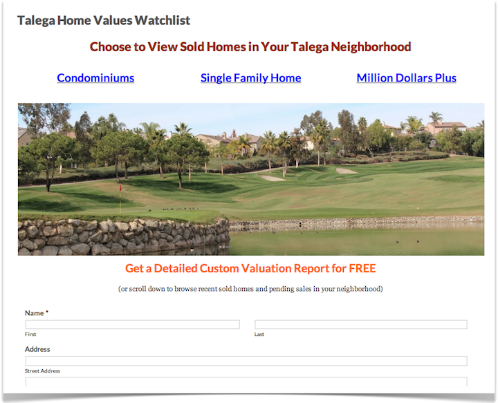
Example #1: Talega Home Values Watchlist
The links at the top of the page take take you to another page on the site where you can subscribe to get email updates on recently sold listings in that area. Click on “Condominiums” for example, and you’re redirected to a page where you can opt-in to the Diverse Solutions IDX map search and get email updates on the latest sold listings in that area.
In order to drive traffic to the page in this example, Scott Schang created a Just Sold postcard listing all of the recent sales in the community. No REO’s and short sales. Just standard sales with the shortest D.O.M. (days on market).
The internal dialog we are trying to create for home owners with this formula is “wow, my neighbor sold their home (for a profit) in XX number of days….and my home is TWICE as nice as theirs!” – Scott Schang
What Scott is doing here is offering site visitors the ability to see what they’re home is currently worth and positioning his offer in such a way as to say, “here, sign up for free updates on the latest sold listings so that you can see what your home would sell for in today’s market.”
If I’m a homeowner:
- I’d definitely be curious to see what my home is currently worth. And,
- I’d be curious to see what homes in my area are selling for (are those sales driving property values up or down for me).
In other words, this page is a perfect conversion opportunity!
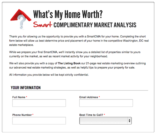
Example #2: smartCMA by M2 Realty
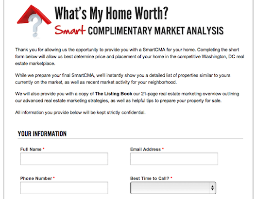
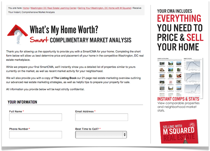
Here, Morrocco, Co-founder of M Squared Real Estate provides an excellent example of a landing page with an effective headline, simple, clear and persuasive copy that highlights the benefits to the reader, and provides a clear Call To Action (submit your information below to get all of these benefits and more).
The benefits to submitting the form are:
- A free market analysis of your home.
- A list of the latest properties for sale similar to yours. And,
- A free report titled The Listing Book – a 21-page real estate marketing overview outlining M Squared Real Estate’s marketing strategies and tips for preparing your home for sale. That way, when you’re ready to sell your home, you know how M Squared Real Estate can help.
While I’m not a fan of sidebars on a landing page because they often take away from the action you want the site visitor to take, here, Dominic provides supporting images and copy that serves only to strengthen the benefits of submitting the form.
Another great example of a landing page primed for generating new listings leads!
What are you waiting for? Get started…
So, now you know how to build a landing page that converts from start to finish.
If you’d like to start generating new listings leads, the first step is to build out your new lead generating landing page. Then, slowly start driving traffic to that page.
You’ve got the tools. I’ve shown you what to do next. Get started.
When you’re done… Drop a link to your new page in the comments. I’d love to take a look. And if you need some help along the way, just let me know, I’m happy to help!

Thank You….. for great info
Pretty section of content. I just stumbled upon your site and in accession capital to assert that I get in fact enjoyed account your weblog posts. Any way I’ll be subscribing on your feeds or even I fulfillment you get right of entry to persistently fast.
Just what I was looking for. Wanted to add a seller landing page and needed a little inspiration. Thanks for showing what M Squared Realty had done.