 All real estate agents share the same goal(s).
They all want to:
- Become the local “go to” resource in their community, and
- Build a profitable real estate business.
In order to do that, they need to cater to four basic consumer needs. Consumers want to be able to:
- Search for the latest real estate listings,
- Access local market statistics to learn how the market is doing,
- Find out what they’re home is worth, and/or
- They want to learn more about the local community. Things like what are the best schools & best neighborhoods to live in.
A great, buyer-friendly, real estate website is going to consist of content that caters to each of those four basic consumer needs, and it’s going to be designed in such a way that it makes all of that content easily accessible to buyers, sellers and people just plain ol’ interested in learning about the community.
The Best WordPress Theme for Real Estate
Is there such a thing as the perfect real estate WordPress theme?
An ideal website template that works right out-of-the-box?
The answer is yes, and that theme is called AgentPress (by StudioPress).
AgentPress is built around a simple idea, that consumers are coming to your website to 1.) search for homes, 2.) find out how the market is doing, 3.) find out what they’re home is worth, and 4.) learn more about the community.
Sound familiar? Yep, your four basic consumer needs like we talked about above.
What’s great about AgentPress and the Genesis framework however, is that not only does it work right out-of-the-box, it also has a limitless potential in terms of customization and design. Which means you can either design it yourself, or hire someone to do a full custom site design for you.
In order to showcase that potential and lend some creative inspiration for your next real estate website project, here’s a list of 12 stunning real estate websites built on the AgentPress theme from StudioPress.
Websites Built on the AgentPress Theme for WordPress
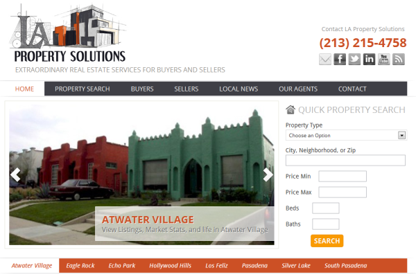
I love the logo on this one (a lot). Great use of white-space. And what I particularly like, is the simple navigation menu to easily access the various communities (Atwater Village, Eagle Rock, Echo Park, et cetera).
Each of those links to a neatly drafted page containing a brief profile and history of the community along with IDX listing data (powered by Diverse Solutions) for an easy home search experience.
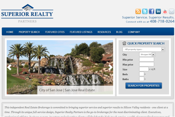
Clean, simple, custom site design. This one pretty much follows the default lay-out of AgentPress which makes it easy to access listing data via the “Quick Property Search.”
3. 904 Living
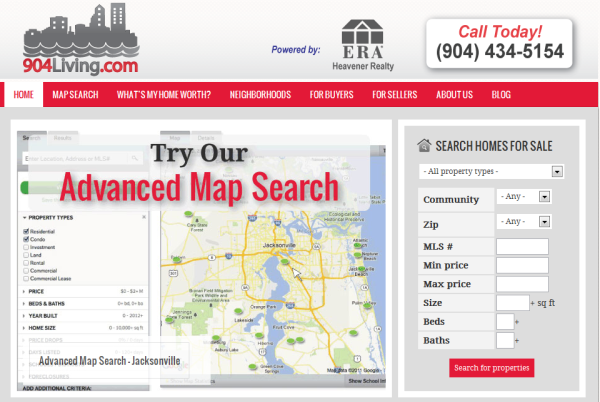
I really like what Jeff Riber did here with the Genesis Slider to hi-light specific Calls To Action. Things like:
- Search for homes by using the advanced map search tool, and
- Search for foreclosures & short-sales.
The images powered by the slider, really put emphasis on the benefits of searching for homes using the tools on the site. I think that’s wonderfully executed.
4. CMGG.net
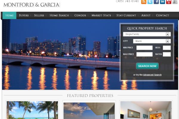
I really like the color scheme here. And the use of the Genesis Slider and images to create a background with the custom IDX search form embedded above. If I want to search for homes, my eyes know where to look and where to go. Also, excellent execution of the “Featured Properties” widget section powered by AgentPress.
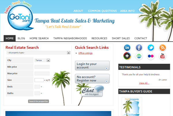
5. GoToni.com
This one doesn’t follow your typical AgentPress lay-out, above the fold. But I like it because it still puts emphases on conducting a home search using the IDX search widget on the left. And, you can easily register to create an account (or login if you already have one).
It’s a fun design. And I dig the Home Buyer’s Guide that goes with it.
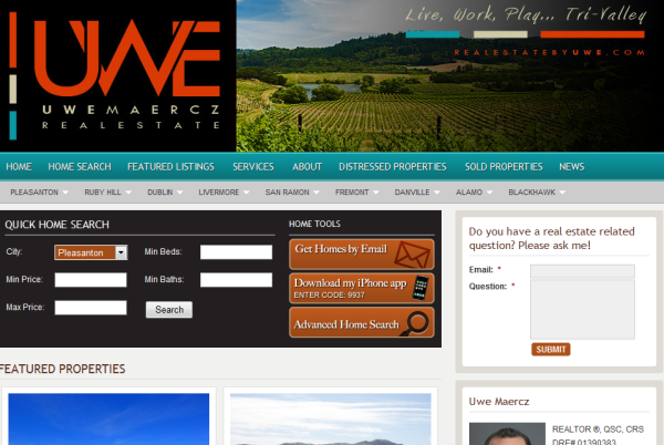
First off, I kind of like the header effect here with the dynamic, scrolling images. I’m not often a fan of things like this because I think it detracts and takes attention away from more important content on a site. But here it works just fine.
Then, I like the custom “Quick Home Search.” In addition to a search function, there’s 3 primary Call To Actions:
- Sign up here to get homes by email.
- Download my (Free) iPhone app to search for homes on the go. And,
- Click here to use the more advanced home search tool.
If you need to ask a question, no problem. Just use the contact form over to the right. Simple.
A lot of really important Calls To Action packed above the fold but not so cluttered that you don’t know what to do next.
7. My 1 Home
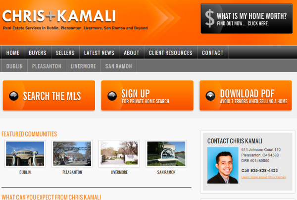
I like the color scheme here (yep, I’m a fan of orange). But also, I really like the placement of the Calls To Action. Rather than placing the 3 primary Call To Action’s below the slider and featured communities, Chris places them prominently above the fold, just below the header and site navigation.
Also, most people place social networking icons and/or contact information in the “header right” widget section of their site. Here, Chris placed a big Call To Action to inquire about what your home is worth – great placement!
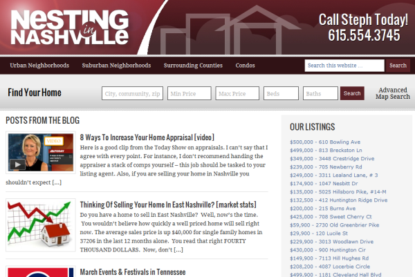
Here, Stephanie went with a standard blog lay-out rather than the default AgentPress lay-out per the demo. But she also added a custom feature… A custom IDX search form displayed prominently below the header and navigation of her site to give site visitors a quick and easy way to search for homes.
The rest of the branding is simple. Great logo on the left, and phone number prominently placed on the right-hand side of the header (just where it should be).
Note: Get in touch with Loren Nason as YourLocalTech.com if you’d like a custom search form like the one designed on Stephanie’s site.
9. Atlanta Real Estate Experts
Here, I like two things…
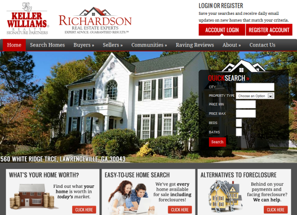
First, the use of the header-right widget section to display login and registration buttons that serve as a Call To Action to encourage site visitors to register to the IDX search (or login to an existing account). If you want to add your similar login and registration buttons to your own site, try the free login & registration icon sets from Diverse Solutions.
Second, I really like the way they used the “Featured Listings” widget section to display their three primary Calls to Action:
- Click here to find out what your home is worth.
- Click here to search for homes. And,
- Click to here to find out how we can help you avoid foreclosure.
Very nicely designed and well placed.
10. Re/Max Texas
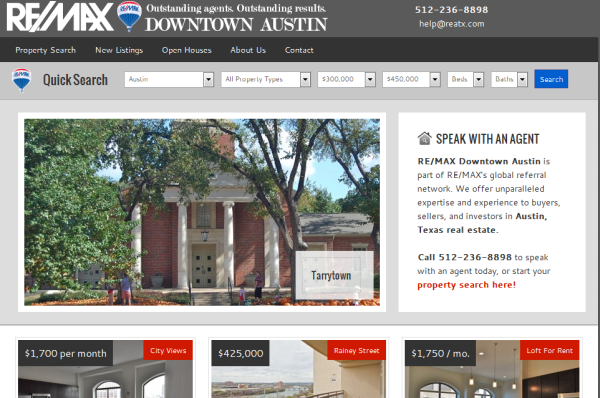
This design uses the standard AgentPress lay-out per the demo site with an added custom feature… A custom IDX search form as in example #8. It’s not overly intrusive and makes it easy for site visitors to search for homes and or easily access the rest of the content on a page.
The rest of the site makes great use of each of the various widgets and elements provided by AgentPress.
The search form here was also designed by Loren Nason at YourLocalTech.com.
11. Angelo Davis
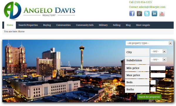
This theme uses the default AgentPress demo lay-out. Aside form the slider and IDX search form, it’s not heavily customized. But I love the use of colors and the branding. Very well done.
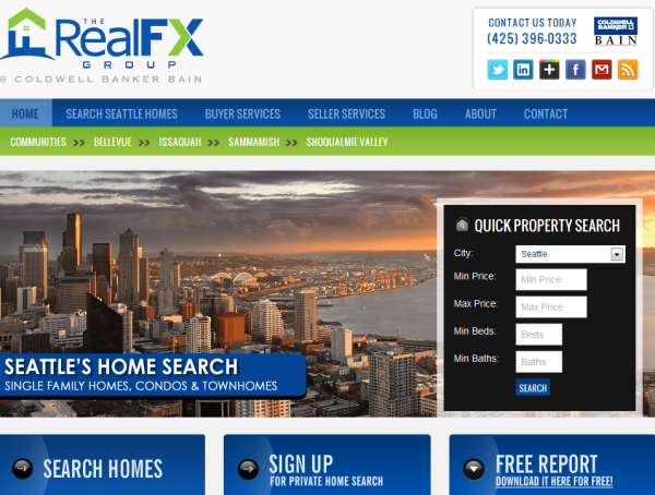
And last, but certainly not least, this is probably one of my favorite custom AgentPress site designs from the Agent Evolution team. In part because I really like Seattle. But also, because Tony is writing up some killer content pages full with IDX content and it’s back by a beautifully executed design and Calls To Action.
Have any favorites?
Several of the sites showcased here are semi-custom and full custom site designs developed by the creative team at Agent Evolution.
Others are a do-it-yourself effort.
Still, I think each is carefully designed to cater to the consumers four basic needs/interests.
So, whether you’re hiring someone to design a site for you, or you plan on doing it yourself, I hope these sites give you an good idea of what you can accomplish.
Do you have a favorite design from the ones listed here? Any ideas on what you can implement to improve your own real estate website?
//
In need of a great WordPress theme for real estate? Get AgentPress today!

Thanks Ricardo for the shout out! I’m still working a bit on my home page layout. I prefer the blog format because I think it has more SEO benefit. A lot of agents use up too much space above the fold with images – IMHO. Large images are slow to load and don’t promote calls to action.
My custom quick search has been an awesome addition. It promotes registrations and takes the client to the thing they want to see immediately = homes for sale. I vastly prefer the quick search to link to the full dsSearchAgent over the IDXpress which doesn’t offer as much lead capture functionality.
Stephanie: I can certainly see that. Meaning yes, it’s easy to clutter your a website with too much un-necessary above-the-fold content.
Really happy to hear that the search form is working out well for you! And if I remember correctly, Loren designed that one quickly 🙂
Nice sites for sure.
@stephanie, glad you are loving that search bar. Everyone I have set the up are loving it as well.
Regarding what you said about blog format and SEO. No difference.
Sliding images I will agree have no benefit. I like showing recent blog posts on home page but as teasers not full posts.
This is a magnificent post! Thank you so much. I want to use the AgentPress theme for one of my Realtor clients.
Thanks Jenna!
What I like about AgentPress, is the flexibility in design. It works right out-of-the-box for those that don’t know how to code a customize a design themselves. And, as you can see from the examples above, it’s a very flexible framework for designing a more custom look and feel.
If you give it a test-drive, let me know what you ultimately think of it 🙂
Woohoo Ribeezie! Thank you so much for including a great many #agentEVO designs…which of course are ALL created using the Genesis Framework and AgentPress. A quality theme gives you the power and flexibility to deliver a valuable experience to your consumers. 😉
My pleasure Nik-Nik! Of course, you all make it easy with such great designs 🙂
Great Post Ricardo. To your knowledge, can you remove the header, sidebar and footer from subsequent pages within the AgentPress Theme? That’s important to me when I am working on my own site. I want to be able to create landing pages without much hassle. All of the sites you selected would keep me on them for hours, which is an element of good design, right? Stickiness!
Hi Angie,
Well, for the sidebars, that’s simple. When you’re creating a post or page, you can select the lay-out for that post or page. The option to do this is just below the post editor. It reads: “Lay-Out Options.”
There, you can select to remove the sidebars all-together and do a single column lay-out. Or, if you’re using the Simple Sidebars plugin, you can create and use a custom sidebar for that post or page. (For example, I’m using a different sidebar on this post than I am on the home page).
As for the header on the other hand, you’d have to create a custom page template, and drop it into your AgentPress theme. Then, you can remove the header from that page by removing a few lines of code.
Here’s the tutorial for creating a landing page for AgentPress (though, that should already be a part of your theme if I’m not mistaken):
http://www.studiopress.com/tutorials/agentpress-new/landing-page.
Hope that helps!
Thanks Ricardo for the reply. I am using the pagelines theme which has layout options and the ability to remove header, sidebar, and footer within one click. Although, I do like the look and feel of AgentPress. Removing lines of code always scares me. I don’t want to break my theme…lol.
I love looking at various real estate designs! Thanks for compiling this list. I have a good friend in my neighborhood whose site I love. I’m not sure of his platform but I will give him some love by posting http://redbrickprop.com
Such a great selection!
I like the helpful information you supply to your
articles. I’ll bookmark your weblog and test once more here regularly.
I am moderately certain I’ll be informed many new stuff right here!
Best of luck for the next!
Good day! Do you use Twitter? I’d like to follow you
if that would be ok. I’m undoubtedly enjoying your blog and look
forward to new posts.
Great blog you’ve got here.. It’s difficult to find good quality writing like yours these
days. I really appreciate people like you! Take care!!
wonderful put up, very informative. I wonder why the
other specialists of this sector do not notice this.
You should proceed your writing. I am sure, you have a huge readers’ base already!
Hi there colleagues, good paragraph and good urging commented here, I am
genuinely enjoying by these.
I just couldn’t go away your web site prior to suggesting that I extremely loved the usual info an individual provide for
your guests? Is going to be again steadily in order to check
out new posts
Hey very cool blog!! Man .. Excellent .. Superb ..
I will bookmark your site and take the feeds additionally?
I’m satisfied to seek out numerous useful info right
here in the post, we need develop extra strategies on this regard, thanks for sharing.
. . . . .