 Generally speaking, the more you write, the more traffic you get.
After all, “Content is King,” right?
Now let’s assume you’re consistently writing high quality content for a specific audience (your audience). It’s genuinely great content, but still, none of that traffic is converting.
Your email list isn’t growing and people aren’t buying what you have to offer.
But why?
You have a nice looking blog design, you’re consistently writing fresh new content.
Still, nada.
Well, you’re doing nearly everything right. Here’s what you’re doing wrong though…
Mistake #1: You don’t have any contact information displayed on your site.
Goal: Generate quality buyer/seller leads.
If you have a real estate blog, and your primary goal is to generate high quality home buyer or seller leads, then you need to make it ridiculously simple for people to contact you.
Yes, I know. You want to keep you phone number and other contact information private because you don’t want solicitors calling you to pitch you on their product and you don’t want slimy marketers adding you to their email list.
I get it. You’re trying to screen people.
But you’re also alienating that small portion of people who are ready to make a buying/selling decision. They read your latest market report, they saw a property that they liked using your home search tool, and they have a quick question about that listing. But alas, your contact information is nowhere to be found.
Well guess what? You’re doing yourself more harm than good by not having your contact information prominently displayed on your website.
At the very least, I should be able to find your contact information in one of the following places:
- The header of your website. I suggest placing your phone number and email off to the right of your website header. This way, it’s prominently placed and easy to access no matter what page of your site a visitor lands on.
- Your contact page. If I clicked on the “Contact” tab of your website, I expect to be able to find either a.) your phone number where you can be reached, b.) an email address, or c.) a simple contact form in case I want to ask you a quick question. I like it when websites display all three. But at least one of the three will do.
- The footer of your website. I’ve talked about website footer designs before and how they’ve evolved from a simple place to host copyright information to a place where you can display an extended set of navigation items and yes, contact information as well.
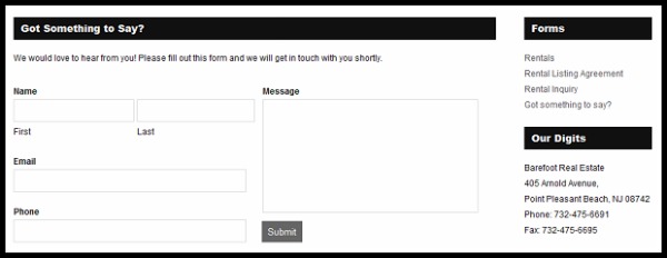
Here’s a great example of a real estate website that strives to make it easy for consumers to get in touch whenever they have a question. Not only is their phone number prominently displayed on the header of their website, just below their logo, but they also include the following contact form and contact information on the footer of their website. That form displays on every single page of their site.
Have a real estate question? Simple, just fill out the form and we’ll get in touch right away.
Can’t wait and/or prefer to call us? No problem, here’s our phone number.
How much do you want to bet this converts much better than having someone struggle to find your contact information?
Mistake #2: An empty About page.
Goal: Convince people to subscribe and/or buy from you.
When someone clicks over to view your About page, they’re essentially expressing an interest. Whether that’s learning more about you and what your blog is about before they subscribe, or learning more about you, your credentials, and who’ve you’ve worked with in the past before making a decision to work with you.
It’s simple really.
They read something > They liked it > They click over to your About page to learn more.
What they find and read there is going to make all the difference in the world. You’ll either hook ’em, or loose them forever.
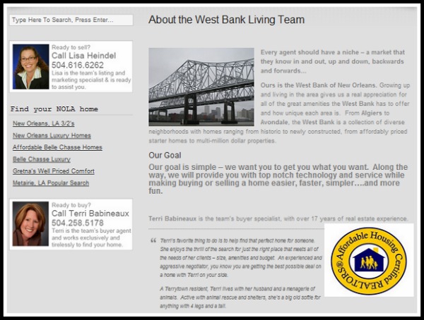
Here’s a great About page from real estate agent’s Lisa Heindel and Terri Babineaux:
(Site link: http://westbankliving.com/about)
Here’s what I like about it:
- It has personality and it reads naturally, as if they were talking right to you. No canned copy like you find on most agent websites.
- They help put a face to a name with a picture and their contact information readily displayed.
- They use authoritative words and statements to communicate their value proposition. They say, “Here’s why you should work with us…” then they give you each of the reasons why. No fluff, just point-blank, authoritative statements.
- It’s backed by actual client testimonials. They’re saying, “don’t just take our word for it, here’s what other people have to say.” (I wish more agents made use of client testimonials on their websites).
Take this quick, 1-minute test:
Take a look at your blog’s About page, does it quickly and effectively communicate who you are and what you do? Does it communicate your value proposition? In other words, does it persuade me on why I should work with you over any other agent in the area? And lastly, is it backed by actual client testimonials?
If you don’t have an About page, well, you’ve pretty much failed that test and it’s time to get to work!
If you do have an About page, but a lot of those key elements are missing, time to tidy it up a bit.
(Email me via my contact page when you’re done editing it, I’m happy to critique it for you for free).
Mistake #3: You don’t have an email list (or your sign-up form is incredibly ugly and/or hard to find).
Goal: Generate a list of high quality prospects that are ready to buy from you.
These days, I use my feedreader less and less. I use two apps to dig through my feeds:
Aside from that, I like to subscribe to blogs I really like by email.
Why? Because then I don’t have to keep checking my feedreader every 5 minutes to see if you’ve published something new. Instead, I’ll simply get an email from you when you do.
Simple.
You write high quality content that I’m interested in reading, and I in return give you my attention and permission to keep sending me stuff via email. The second your content is no longer useful or relevant to me, I unsubscribe.
Again, simple.
By not having an email list, or making it easy to subscribe to your email list, you’re missing out on an opportunity to further engage with me via email.
You’re also missing out on an opportunity to engage with me further about what you have to offer via your products/services. Think of it this way, the more I engage with your content, the more likely I am to consider what you have to offer (via your products/services).
Engagement > Building Trust > New Sale
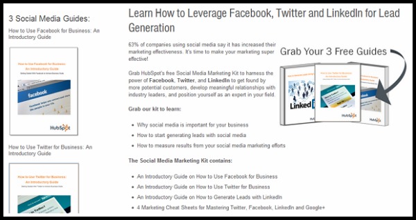
Hubspot is the KING at generating a high quality list of interested prospects. They consistently offer webinars, whitepapers, case studies, and ebooks on subjects that are hot in social media, blogging and lead generation. But they don’t give it all away for free. They sell it to you. But not for money. For attention – by asking you to subscribe to their mailing list.
(Site link: http://www.hubspot.com/social-media-marketing-kit)
Now the question is, how can you apply this to your website/business? What information can you offer people in exchange for their attention (via email)?
Well, if you have a real estate blog, here are some ideas on an free ebook download or email marketing series:
- The Ultimate Guide for First Time Home Buyers
- 6 Pricing Mistakes & How To Avoid Them: the Ultimate Guide to Selling Your Home for Top Dollar In Today’s Market!
Mistake #4: You blog posts don’t have any images.
Goal: Grab your reader’s attention with a captivating headline, then keep it with strong copy and a complementary image.
 A good image has the ability to set an emotional tone for your post. It not only helps capture your readers attention, it helps break up your content thereby making it easier to read.
So as a rule of thumb, I recommend that every single blog post contains a complementary image that helps capture the story of your post.
Not sure where to find a good image? Brian Gardner (Founder of StudioPress) gives you 5 places to find stock images for your blog posts. And Sonia Simone (CMO of Copyblogger Media) gives you some great advice for using photos from other sources in this post: The Lazy Blogger’s Guide To Finding Great Post Images.
Don’t want to pay for a stock photo? Then take your own photos! This should be relatively easy to do especially if you’re in real estate.
Don’t have a camera? No problem. Lucky for you, you don’t need one. Today’s smart phones can produce a high enough image quality for use in your posts.
Always include a photo when you publish a new post. But remember, no photo is better than a bad photo.
Basically, find a photo and make it a good one. Because a sh*tty one will ruin the post.
Mistake #5: You’re over-optimizing your post titles.
Goal: Optimize your posts so that you get found in search results.
In a previous post on the Diverse Solutions blog, I shared a quick blog post SEO checklist. The main points being:
- Do you keyword research to find out what phrases people are typing to find something in search results.
- Optimize your post headline. For optimal title-tag SEO, you should aim to place your keyword phrase as close as possible to the front of the headline.
- Then, optimize your post slug. When you write a title for a new blog post, WordPress automatically generates the post slug for you by placing every word of your post title into the URL. What you want to do is edit your post slug to contain your primary keywords that you selected to optimize your post.
These are all pretty basic tasks that you can perform but that can have a huge impact in your search engine results.
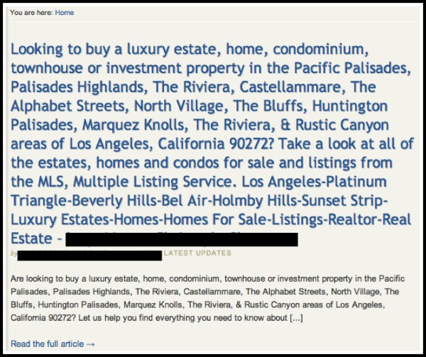
BUT, there is such a thing as over-optimization. For example, here’s a blog post title that takes keyword stuffing to a whole new level:
The text in blue is the actual post title. Then, the actual text within the post is below and follows the same pattern. (I’ve blocked out the author name and website and purposefully and didn’t link to the site.)
This is a classic example of someone trying to optimize for search results, but failing to take into consideration converting readers into buyers.
If you were a home buyer looking for homes for sale in either of those coverage areas, and you came across this site (or that post), how would you feel? Does the text catch your attention (in a good way)? Would you stick around and continue to search for homes? Or would you feel all icky and slimy and click off to search somewhere else?
I’m not sure about you, but nothing about that post makes me want to stick around. It’s kinda like when you walk into a bar, take a quick look around and say yourself, “Nah, I’m not feeling it, let’s get outta here!”
Mistake #6: You’re not updating your blog often enough.
Goal: Continue to drive high quality traffic to your site.
There’s nothing worse than visiting a real estate blog (or any blog really) that hasn’t been updated in more than 3 months. Especially when the market and mortgage rates are in a constant state of change.
If I’m browsing, looking for information on a specific area, and I happen to come across your site in search results, but I see that you’re last post is dated 3+ months ago, you’ve lost me. (You’ve just lost a potential lead).
Well, there’s a couple of ways to handle this.
First, publish more often. (I know, genius!)
But seriously, if you’re using your blog as a way to generate leads, you need to treat it like a business and making writing a mandatory part of your routine. Put another way, you have no excuse for not writing new content.
If you’re stuck on ideas, I recommend Real Estate Blog Topics (proud disclosure: it’s my membership site). You’ll get a healthy dose of blog topics delivered weekly in addition to access to case studies from other realtors on what’s working and what’s not.
Or, if you’d rather have someone write the content for you, check out Bring the Blog. At $57 per month, they’ll write a blog post for you every business day.
Second, create a static home page for your blog. And add your blog as a tab on your navigation menu.
To do this, simply perform the following steps:
- Log into your WordPress dashboard,
- Create a new page (title it “Home” or “Welcome”) and add the content that will essentially become your new home page/landing page.
- Then, scroll down to your “Settings” section and click on “Reading.”
From there, you’re going to select the radio button to display a “static page” for your front page display. Simply select the new page you created from the drop-down menu as shown below:

The benefits of creating a static page as your home page is that now, any time a new site visitor comes to your site, a post dated 3 months ago won’t be the first thing they see. Instead, you can direct them to other areas of your site like your home search page for example.
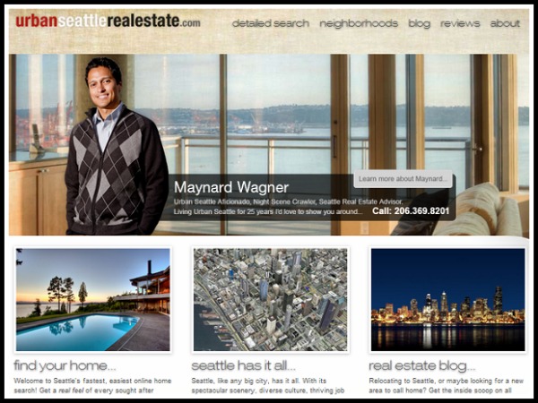
Here’s a great example of a real estate website that uses a static home page with a link to their blog in the navigation menu:
(Custom site design by ha media group)
Still a pretty great design, eh?
But Ricardo, what if I’m doing everything right?
Well if that’s true, then you’ve got nothing to worry about. Sit back, relax, and just keep doing what you’re doing.
But if I’ve called you out on any of these all too common blogging mistakes, time to take some corrective action!
What are you waiting for? Get started!

