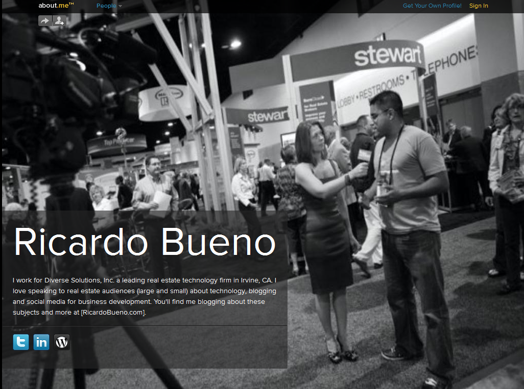
If you’re looking to create a kick ass personal landing page for yourself, then the ever-so-popular and growing About.me portal has just opened up to the public this week and it makes creating a personal landing page site really simple.
It’s similar to Flavors.me which I haven’t used before. Just pop in your bio, upload a background image, and link to your favorite social networks and presto! you’re all set to go. You’ll have access to all sorts of analytics including views, clicks, links to you, average time spent on profile, total historical views and new visitor percentages.
So if you’re looking to create a landing page, About.me might just be what you’re looking for (simple design and effective analytics). If you happen to set yours up, share the link with me in the comments so that I can check it out.
Here’s mine. Though I’m still focused on driving traffic to my Best Of page here on the site. What do you think? Is something like this useful to you? How would you use it as a marketing tool?


Both site are now in my sights to checkout! Thanks Ricardo.
Feliz Navidad, my friend.
Merry Christmas (and soon to be Happy New Year) to you too amigo! Let me know if/when you set up your About.me page 🙂
Coincidentally enough I just set up my about.me today. http://about.me/dahliakurtz … Still toying with ways I may improve the design. For now, keepin' it simple. I do however, dig your design. Nice.
Dahlia: I like your tagline “Need a voice? I write very loud.” Great photo too. Maybe a white or lighter background? Otherwise I think it looks great!
I had trouble looking for a photo myself because my headshots weren't high enough of a resolution to fit the screen. Then I settled on the photo I'm using now.
I think your photo is great, because it captures a moment. Makes you real. Keep it… Yeah, I toyed with a white bg. It looked odd. I think I need to either change the black bg, like you said, or create some sort of black ripped piece of paper looking frame (if I can) for my pic, then put it on a white bg. Thanks for the advice – and compliments.
Aw, why thank you (in regards to the photo). I really was going to change it if not for your feedback 🙂
How about a patterned background or turning your photo into a Polaroid? I've used Picnik.com to do that with a previous header photo here on the site. It's a great photo.
You're welcome. I'm flattered.
So, I took your advice and did a polaroid so the black bg now works better. I had to decrease my font a bit to make it work. Let me know what you think. And now my new favourite site is Picnik.com. Thanks!
Ah, there ya go… The polaroid works/looks great! Font is perfect, so's the background and I still dig the tagline.
P.S. Picnik works great for minor edits here and there 🙂
Agreed. And agreed! Thanks, again.
You're welcome! Awesome to connect!!
Happy New Year Ricardo, set my about.me page up http://about.me/durrellt, wrote a blog post about it too back in Nov. The best part about it is Free.
Durrell: Merry Christmas and Happy New Year amigo!
Love the use of the image and the Dr. Suess quote. Simple and effective. Yes, it's easy to set up and it's free. I'm thinking it makes great for use in an email signature.