There are 4 primary reasons consumers are coming to your website:
- To search for homes
- To find out how the market is doing
- To find out how much their home is worth
- To learn about the community
When you’re building a real estate website it’s important to take all of these elements into account.
How will you organize your content to make it easy to search? To make it easy for visitors to explore and learn about the various communities (the culture, the geography, and other elements that make your community unique)?
In many cases, you pick a “starter theme” and you customize it to suit your needs. Add a custom widget area here, add another custom widget area there. Change the color scheme, integrate IDX listings, etc.
AgentPress Pro is ready to go!
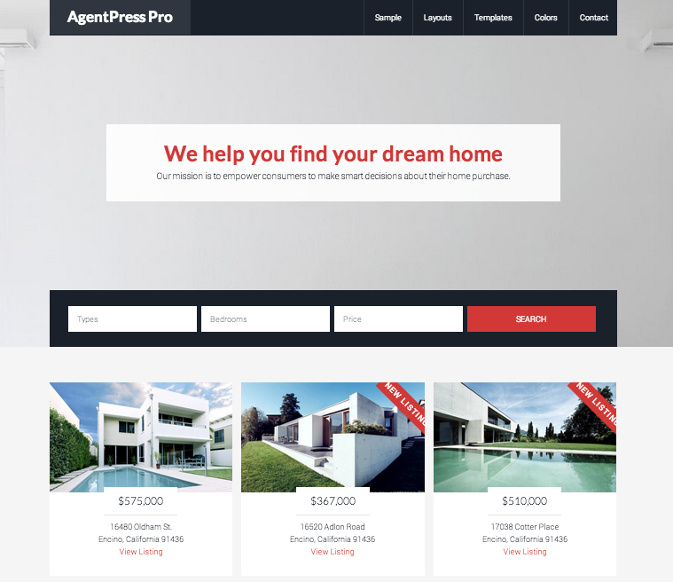
The design team over at StudioPress gave one of my favorite real estate themes a (somewhat long overdue) update … Take a look at the new AgentPress Pro!
It’s mobile-responsive.
Features a big beautiful image on the homepage with an area to add your tagline and/or search Call To Action with an area to add an IDX home search.
It includes a featured listings area so that you can highlight upcoming listings and/or your office listings.
If you’re a writer, you can add a blog section to the homepage. If you’re not, just don’t activate that widget area.
Then, you can easily highlight your community areas with a widget section on the homepage and include your office information just below that.
No coding required. And it includes all of the primary Calls To Action that you want to bring attention to if you’re looking to build a high converting website!


You’re right … it’s long overdue.
And after checking out the demo, I’m surprised it didn’t contain more features.
I know Studiopress builds great themes that web developers can customize but I think they missed an opportunity here in light of the many wp themes exist that are HTML 5 and mobile responsive (and in some cases are child themes built on the Genesis framework).