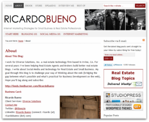
 According to my site stats, my About page is the most visited page on my site. 14.7% of my site traffic navigates to my About page after landing somewhere on my site.
That’s great! To me, I see that as an indication of interest.
It says someone’s interested enough in me or my content to want to learn more. The next step from that point forth is for me to present myself in such a way that persuades them to subscribe.
What makes a good About page?
Naturally, I’ve been reviewing other various About pages to see what seems to work, what doesn’t, what I like and what I don’t like. In my search, I’ve boiled it down to a few key characteristics. A good About page does the following:
- It Communicates the Point of the Site: A good About page makes it crystal clear what the website is about (duh). I’ve seen plenty that really tell me nothing. Kind of shocking really. How can you have an “About” page that says nothing about the site? This actually happens more often than you might expect.
- It Provides Everything You Need To Know: I’ve seen some company About pages that talk about what type of services the company offers. But then, when you try to find out more about the Team behind the company, nothing. Nada. A good About page doesn’t just spew product/service information. I think that a solid About page also hi-lights the team and the story behind the product/service. So don’t just stop at the product, give us more info!
- It’s Backed by Social Proofs: I’ve come across several sites that say “I”m a Speaker” or “Designer” yet they provide no information on where that individual has spoken or shows samples of their work. Hmm… (insert head scratch). A good, convincing About page not only states how/why a website is going to help you, it backs it up with concrete examples. Don’t leave this part out!
As I revisit my own About page, I’m finding some things I’d like to change and improve on. I think I need to work on hi-lighting the reader benefit more and backing it by social proof. Also, given that it’s the most visited page on my site, I need to capitalize on that fact and present more options to subscribe. Which brings me to my next observation…
The Copyblogger Method for An Effective About Page
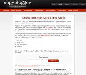
This is probably one of my favorite About pages. It’s structured in such a way that it hi-lights the benefits straight out of the gate and in as few words as possible and it’s optimized to get you to subscribe. Here’s what it looks like…
 Step 1: What is this site going to do for you.
Then, insert an opt-in form.
Step 2: Further develop your idea by establishing yourself as an expert.
Then, insert opt-in form.
Step 3: make it all about you and build a personal connection.
Then, insert opt-in form.
That’s it. Pretty simple, don’t ya think?
What about you?
What does your About page look like? What kind of content do you include in yours? What elements do you think make up a good About page?


Hey Ricardo, Joe from Livefyre here. Thanks for the post, this is something that I wrestle with all the time. My blog is mostly for fun, so I don’t include too many of the steps listed above. I do, however, like to give a few personal details that help tell my story. I appreciate the tips!
@joebertino Well I’d argue that that’s different. If you’re blog is just for fun, then I’d say you can skip a lot of these. But a list of hobbies and things that you’re into might be neat for people to read!
Thanks for the comment – you and the Livefyre team Rock!
@RicardoBueno This is me double liking your comment.
@joebertino lolz!