 Think back to a time when you visited a website looking for something but it was overly cluttered, loading slowly, and full of useless or irrelevant information.
How did it make you feel? Frustrated? Angry? Annoyed?
When your website doesn’t work the way users expect it to, or when they land on a page of your site from a search result that doesn’t serve up what they were looking for, that’s how they feel too. Frustrated. Angry. And confused.
What if instead you focused on creating an awesome user experience. Do you think things would change? You bet they would!
Every time someone lands on your website for the first time, they are having an experience. And the quality of that experience is going to have a significant impact on their opinion of you. Whether they like you or not … Whether it sounds like you know what you’re talking about as they read your copy … Whether you look like a professional who cares about the customer …
Ultimately, a better user experience will lead to higher conversions.
7 Content Renovation Tips for Creating A Better User Experience
Jason Goldberg, founder and CEO of Fab.com sums it up nicely:
User experience matters a lot. More than most people realize. The best designed user experiences get out of the way and just help people get sh*t done. Less is more. If you have to explain it, you’ve already failed.
It’s not just about design and “making things pretty.” It’s about designing for the next step. What action(s) do you want people to take as they move from one part of your website to the next?
What’s the overall experience? Is your content useful and can site visitors find and explore content easily? Is your content valuable and presented in a desirable way? And is your website credible?
If you’re answer is yes to all of these questions, congratulations, you have an awesome website. But if your website needs work, don’t worry, here’s a list of things you can do right now to create an overall better user experience and boost your conversions.
1. Focus on making your design clean and simple
We often think of the homepage as the most trafficked page of your website. It’s the most, if not one of the most, visited pages on your website. Therefore we have this desire to want to put as many items and call to actions on the homepage as possible.
The more call to actions we have on the homepage, the higher our conversion rate, right? WRONG!
The opposite happens. Instead of driving visitors to take action (e.g. subscribe, register to your IDX), you’re simply driving visitors away. It’s sensory overload. You have too much going on.
So instead of overcomplicating things by putting too much information in one place, work on tidying things up a bit. One call to action per page. Create a simpler navigation. Work on creating a systematic flow from one page to the next.
One of my favorite examples of a clean and simple design in action is Greg Fischer’s website fwlocal.com:
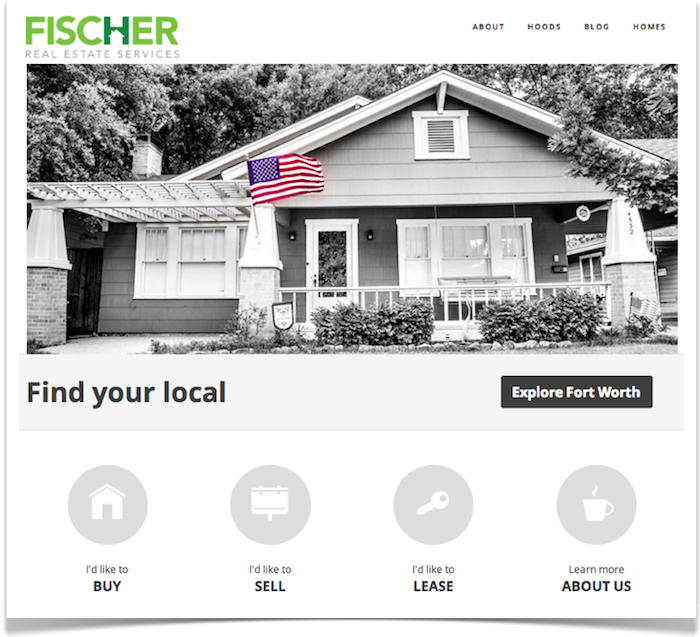
You have a big beautiful image that’s easy on the eyes. A logo with a contrasting color that really stands out. A simple navigation menu. And a few simple call to action buttons that say “welcome to the site, what information are you looking for?”
2. Clean up your navigation to make it easy and obvious
Navigating through your website should be effortless for your site visitors. If it’s not, you lose. But your navigation isn’t just the primary navigation bar at the top of your website, it includes the links that you place on your sidebar and on the footer of your website as well.
Here’s what I recommend:
- Use custom sidebars to create lead generating sidebars on your neighborhood landing pages
- Less is more. Only place information that’s highly useful and relevant to your site visitors
- Clean up your categories and allow users to browse your site’s content by topic
When I visit one of the community pages on Anthony Gilbert’s website (realfx.com) for example:
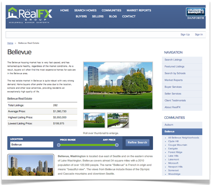
…see how he uses the sidebar to link to additional smaller communities within the greater Bellevue area. The navigation isn’t just on the header of the website, it’s on the sidebar.
Most website visitors leave after viewing just one page on your website. It’s your job to make your content enticing and easier to navigate so that they continue viewing and discovering more pages of relevant content.
3. Give users a place to start
Call out the main goals of your site on the homepage but don’t overdo it. Think about the 3-4 reasons consumers are coming to your website to begin with:
- To search for homes
- To find out how the market is doing
- To find out what their home is worth
- To learn more about the community or learn more about the buying/selling process
It’s your job to organize your content and give users a place to start. In doing so, you’ll give them a reason to stick around and keep reading.
One of my favorite examples of this in action is M Squared Real Estate’s learning center:
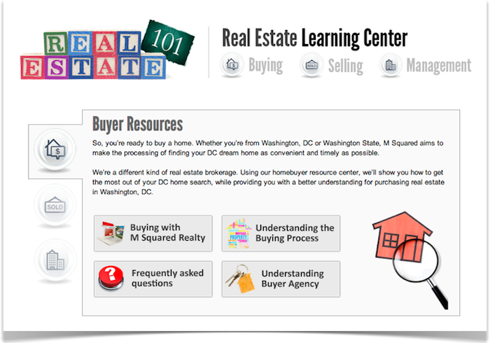
If you’re a first-time homebuyer or thinking of selling your home, they do an excellent job of explaining the buying and selling process.
So let’s say a user (i.e. potential homebuyer) has come to their website looking for information as they get started on their home buying journey, M Squared Real Estate has effectively given them a place to start by serving up useful content on a specific section of the site that they can click through and continue to read.
Trust and attention is built around great content. All you have to do to maximize the experience is give users a place to start. Guide them to where you want them to go.
4. Put some serious effort into dressing up the content you create
Poorly written content will quickly drive site visitors away. Have you ever clicked on an article headline only to be largely disappointed by the content that was delivered. It was short, didn’t deliver on the promise of the headline, and totally useless. In short, it was boring.
What did you think? It was probably something like: “Wow, that really sucked! Well, I’m never reading content from that website again…”
Not to sound harsh, but lazy content gets noticed too (and not in a good way). Getting lazy with your content creation efforts is a surefire way to drive site visitors away. And we don’t want that, do we?
So from here on out, focus on the following:
- Craft a magnetic headline for each piece of content you write
- Use subheads to break up your content
- Use bullet points to make your content scannable and readable
- Use a captivating image to compliment your text
Sure, creating great content on a consistent basis is hard work. But here’s a great checklist of essential elements every blog post needs to keep you on track.
5. Always move users towards the next step
Always think about and design for the next step. For example, when a user lands on your homepage, what do you want them to do next? Where do you want them to go? FWlocal in the example above makes it easy… If you’re looking to buy, click here. If you’re looking to sell, click here. Or if you just want to learn more about us, click here.
What about your community pages? When a user lands on a community page, what do you expect them to do next? Is your navigation structured so that more related content is easily findable? Do you want site visitors to click to search for homes and is that action step clearly stated?
How about your landing pages like your market reports page or your home evaluation page? Have you created a compelling offer to compel users to complete the next step?
When you’re setting up your landing pages or structuring your home page, always design for the next step. The next step might be to click to another page or to complete a task (register, subscribe, submit a form). With each piece of content, design for the next step.
6. Optimize your landing pages
Landing pages are critical for conversion because they’re likely the page a site visitor clicked on from a Google ad. Or your Facebook ad. Or some other call to action placed somewhere prominently on your website.
If you have a real estate blog, a landing page serves one of the following functions:
- Get a visitor to click to another page (e.g. a smaller community page within a larger community)
- Get a visitor to submit a form request (e.g. to request a free home evaluation)
- Get a visitor to register by email (to get blog updates by email or register to your IDX to get listings by email)
- Get a visitor to learn something in order to build trust and rapport
A great landing page focuses on making users take action towards one of these steps.
The following is an example of two separate landing pages on different websites for a free local market report to find out how the market is doing:
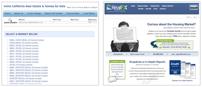
Which one do you think is performing better? The one on the left or the one on the right? (Yes, that’s a rhetorical question). The one on the right is the clear winner. Here’s why:
- It has a captivating headline
- It’s using images to grab your attention
- It has one primary call to action – fill out a form to receive your free market report
One page. One high value offer. One action step to take.
The site on the left on the other hand ignores all basic aesthetics. No landing page copy. No headline or value proposition. No imagery or basic copy guiding you on what to do next. Just a list of links for you to click through with no specific desired outcome.
If you’re looking to improve your conversion rate, don’t be lazy. Take the time to optimize your landing pages to create irresistible offers.
7. Help users trust you
Trust is not built instantly, it’s a long term process.
When a site visitor comes to your site for the first time, it’s your job to deliver a great user experience in order to convince them to turn into a repeat visitor. Were they able to find what they were looking for? Was the information useful? Was it helpful? Remember, trust and attention is built around great content.
In addition to crafting a good user experience and delivering useful content, you can also use certain trust indicators to accelerate the trust building process with your site visitors. This includes things like:
- Displaying customer testimonials prominently
- Displaying your contact information (phone, email, photo, DRE number)
- Displaying recently sold properties to puff your chest and show potential sellers how many homes you’ve successfully sold
- (And though less visible) responding to ALL inquiries or comments in a timely manner (and by “timely” I mean immediately)
Conclusion
Carefully crafting a better user experience can lead to substantially better results. The first step is to sit down and analyze what that experience should look like every step of the way. In other words, take a look at your homepage and design for the next step. What are the 3 primary functions you want people to perform?
When someone visits a community page, what do you want them to do next?
When someone visits your market report landing page, what do you want them to do next? What action do you want them to take?
Always, design for the next step. And optimize the experience to make it useful, desirable, and valuable. Ultimately, that’ll lead to higher conversions!

We have become so visual now that I’ll leave a site right away if it is cluttered and too much going on. If it’s not visually appealing then you’re already playing catch up.
I have actually went away from sidebars on pages and only having them on posts. Looks cleaner to me that way and the feedback has been the same.
Re: “If it’s not visually appealing then you’re already playing catch up.”
Funny how just a little more effort in adding the right image to a post or landing page makes a HUGE difference. So agreed, it’s all about “how can I make this more visually appealing” and thus, making your content that much more desirable.
I was using a single-column layout myself for a while but then also quickly realized, people are actually clicking on those links on the sidebar 🙂
Awesome!! Ricardo I love this post, you did a great job talking about the most important parts of a site. Thank you – T 🙂
No, THANK YOU, Theresa! You’re awesome and thanks for sharing!
Ultimately, putting a little more effort into how every part of your site functions will reap huge rewards. Like I said in the post, always design for the next step and the action you want the user to take. Sounds simple, but so many people fail to do that. And that’s why they don’t have better conversions.
I have actually went away from sidebars on pages and only having them on posts. Looks cleaner to me that way and the feedback has been the same.
you did a great job talking about the most important parts of a site.:-)
A clean design is something I went forward with, with how my content is presented on Internet Dreams.
I love simplicity and I made sure my newest design right now is as simple as possible.
Thanks for the article!
– Samuel
When you’re setting up your landing pages or structuring your home page, always design for the next step. The next step might be to click to another page or to complete a task (register, subscribe, submit a form). With each piece of content, design for the next step.
Getting across what it is your blog is offering readers at first sight is vital. That’s the first step to building positive customer experience. Being helpful is another.
A really effective way of doing this is to create a Resources page. It’s one of the most visited pages on any blog and can be highly beneficial where optimisation is concerned. Plus, it’s a great opportunity to include links to other relevant blogs in your industry (which can generate links on social media from those blog owners too).
You always get me thinking and as I get close to the final switch over to a cleaner 2014 theme, I want to tweak it a little more to make sure I am being clear. Was that clear?
This excellent post is one I plan to study and recommend to others.
This article is great. I completely agree with only having 1 call to action per page, anymore it’s just too much.
that is nice post !
Better User Experience most.
mostly depend upon content themes and site structure……
I read your blog It is very helpful.
Wow this is really good information !
I like this post, it’s really nice post.